Friday 30 January 2015
Evaluation Progress - 30th of January
A draft is completed for each of the 4 questions all we need to do is film and upload them which should be completed within the next week.
Thursday 29 January 2015
Evaluation Progress - 29th of January

This is a draft for Question 3 so far as we have up to question 8 and will continue to add the other questions such as 9 and 10, also we will add feed back from the class and Ben Young from Teeside University which was very useful as he gave us useful information as to how to further interest the audience. We will further add how we learned from audience feedback and used it to advance our final product.
Tuesday 27 January 2015
Evaluation Progress - 27th of January
This lesson we have made progress to my evaluation Question 4 by adding a further analysis of how we have created brand identity and why we've used certain things in our product.
Monday 26 January 2015
Friday 23 January 2015
Comparing Our Digipak
This post will compare our own digipak (shown below) to other digipaks from bands in the same genres/sub genres, as to show off the conventions that we used to create ours.

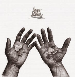

Our first example is the Lower Than Atlantis album 'World Record'. The album is a white background with two very well drawn open palms on the front, with various items that are supposedly carried by students/musicians (this is their target audience). As you can see, from the image below, they have used no colour what so ever in their album artwork, this could relate to the dark nature of the songs. In our original designs for the music video, we were going to have the narrative in black and white, in which our digipak would also have been to create brand identity, The album doesn't show any band members and only has artwork, possibly to show the creativity of the band or to create a link to their lyrics. Our digipak follows this convention to an extent, in which we used artwork for the outer part of the digipak but used the band on the inside as to follow the convention of the its second sub genre.
Our second example is Sum 41's album 'Underclass Hero'. The album uses a black and white picture of the lead singer to contrast against the bright pink text. This draws attention to the audience and will most likely grab peoples attention. The image below shows Deryck Whibley, the lead singer of the band, who is the star image and is used in most of their products. The image relates to the convention of the punk rock genre, in which the bands are often shown in the digipak. To follow this convention, we chose to use several photos of the band for the audience to identify with who they are. We used a photo of all the band together, one of the lead singer and another of the other band members, to identify with the theory of star image, by focusing Lewis away from the other band members.
Thursday 22 January 2015
Brand Identity Between Our Products
Our media products feature the same elements as each other in order to form a brand identity. This is important to help the audience recognise the company and increase sales of the final product. Good branding can differentiate you from other products that are similar to your own and can give the audience a reason to choose your product over another companies.
We originally decided that the performance side of our music video was going to have a lot of dark shots with bright lights, to create a great atmosphere for our piece, whereas the narrative shots would feature lighter shots to contrast against the performance. To recreate this contrast with our other products, the digipak featured bright backgrounds for the outer sides with darker backgrounds on the inside. The advert was harder to do this for as it was only one side, nonetheless we managed to create a suitable advertisement that linked with the same theme.
Another way we linked all our products was with the colour scheme that we used. This featured black, white, green and grey. The darker colours were used to make the white and green stand out more. These colours were mainly used in our advert and logo with some aspects in the digipak. The original design for the digipak featured a lot of similar colours to the final advert, however we felt that the final digipak needed some contrast to the the advert and some brighter colour used.
All of our products feature the company logo (below) which was designed on photoshop. The design is fairly simple yet effective, using the colour scheme to make everything stand out. The Music Video features the logo flashing before the song starts, showing the audience that it was created by our company and that we are associated with these products. The digipak features the logo on the back side, next to the copyright information, and also on the spine, to show that the band is signed to our company. Finally, the advert shows the logo in the bottom half of the poster, which shows things that are associated with the band (HMV, YouTube page, band website).
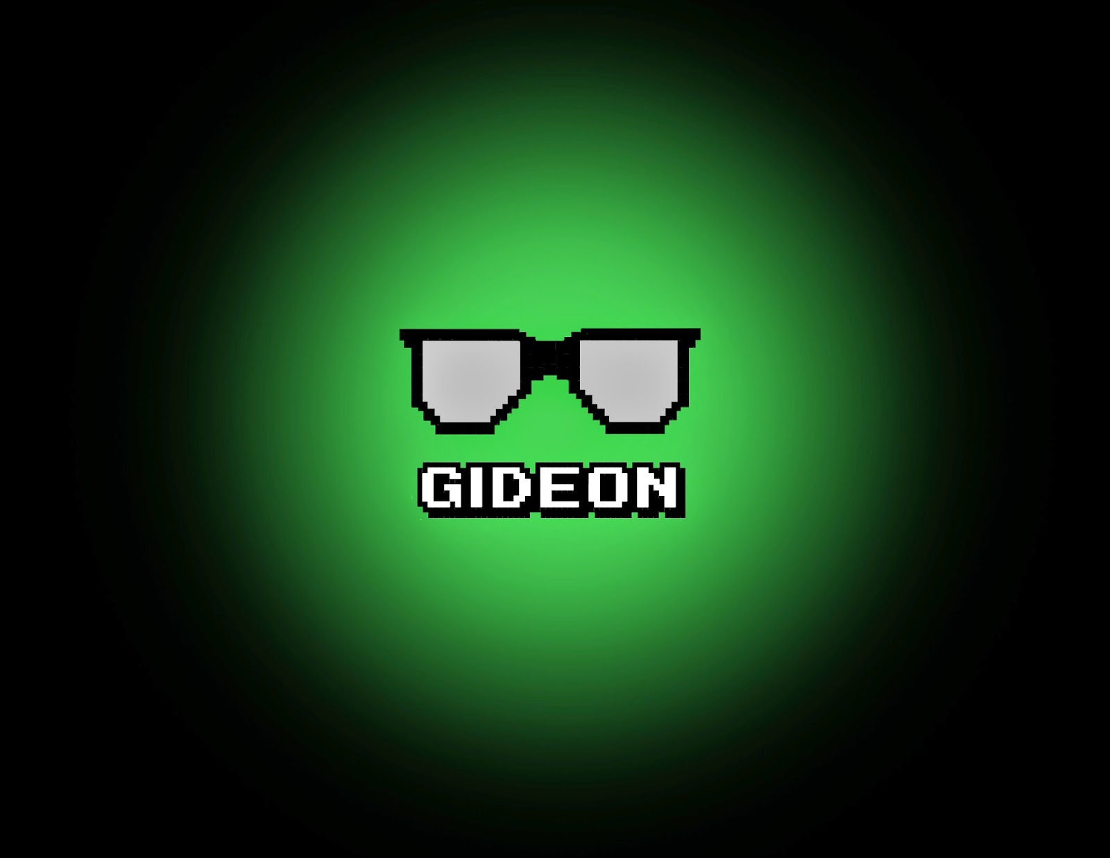
The extended logo shows a black background with a green circle that gradually fades out. On top of this is the text, Gideon, and glasses, both of which are made in 8 bit. Our original idea for the name came from the popular animated book series/movie, 'Scott Pilgrim Vs The World'. The series focuses on a boy who is in a band who arent well known, fitting with the same characteristics of the band we have chosen. We named our record company after the main antagonist and styled it after the movies theme of 8bit; the glasses represented Gideons character in the series so we chose those to represent our company.
Monday 19 January 2015
Evidence of Filming- Sunday, 9th of November

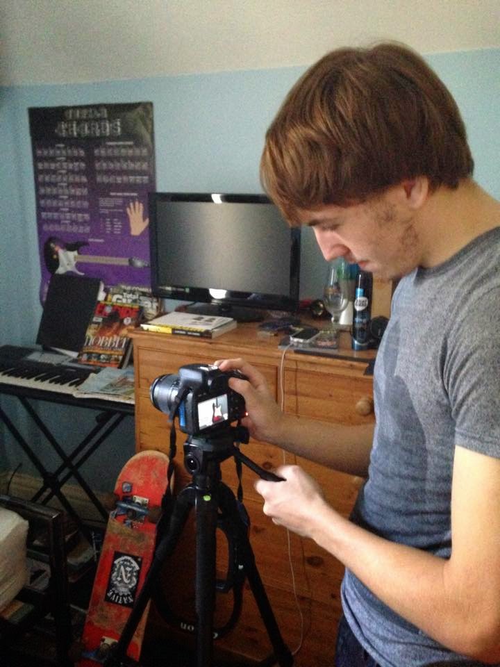
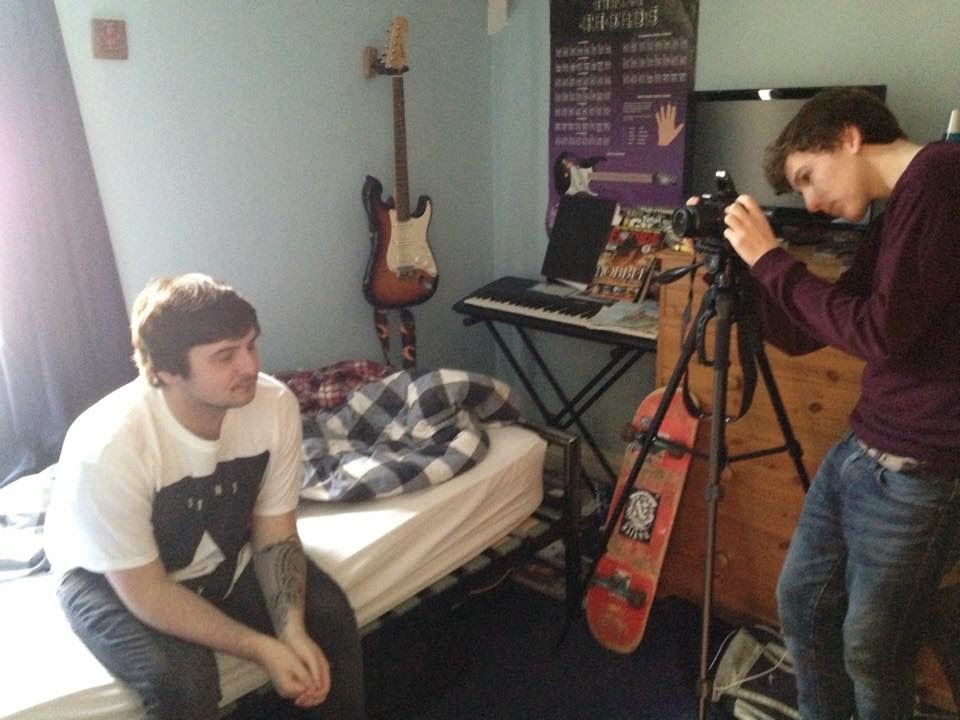

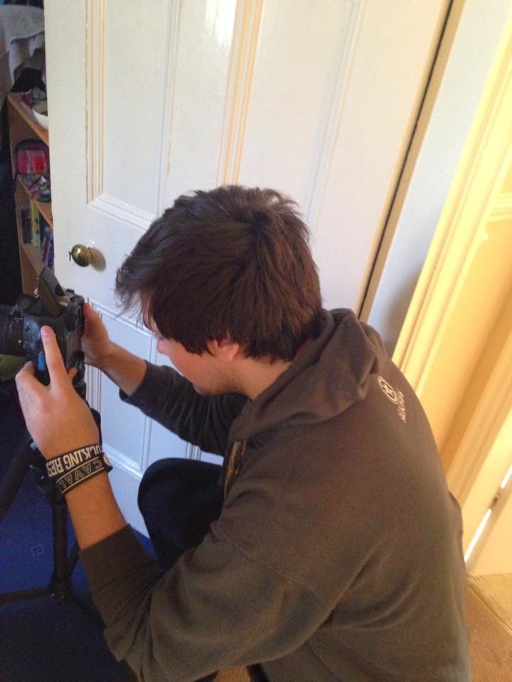

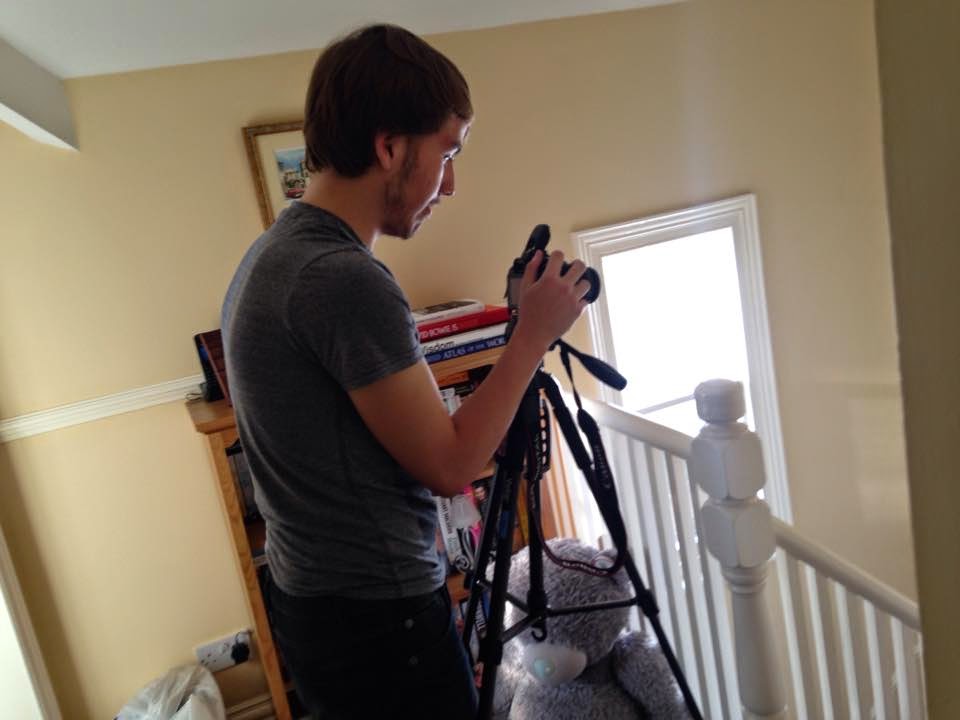
These photos show evidence of all of our group members filming on our first day of filming for the narrative structure of the video on the 9th of November.
Tuesday 13 January 2015
Final Digipak
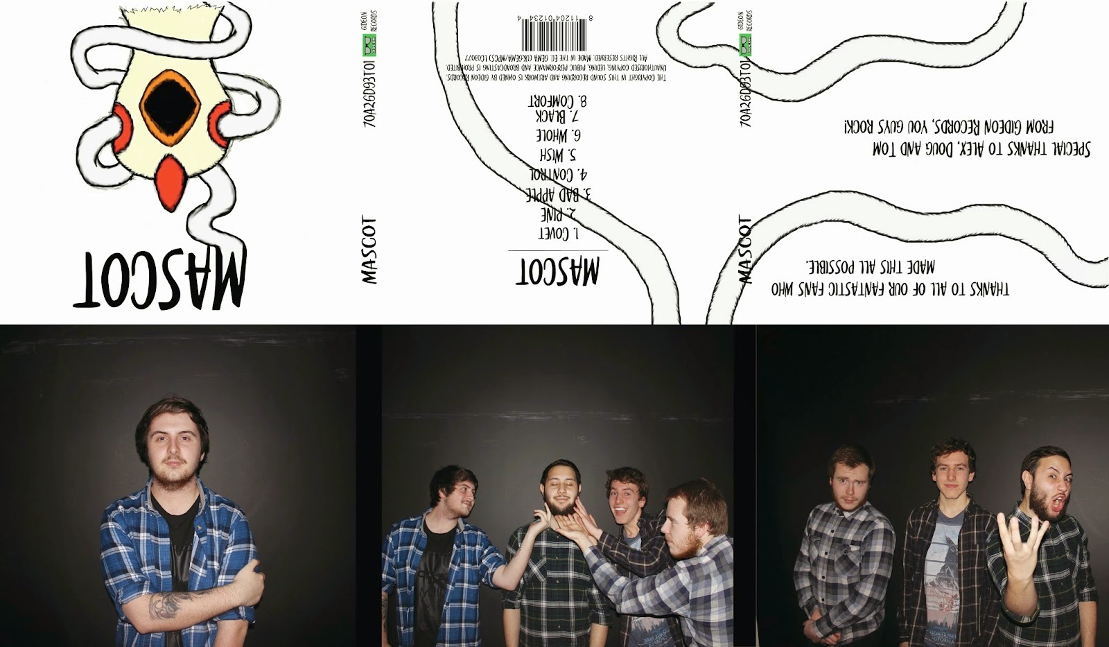
This is our final digipak idea. It features common conventions from the post hardcore genre by having images of the band on the product, especially the star image used. It also fits with the convention of punk rock genre where it uses artwork for the digipak. To fit with both conventions, we have combined the two, having the artwork on the outside of the digipak and photos of the band on the inside.
Subscribe to:
Posts (Atom)