https://www.surveymonkey.com/s/D75CCTJ
We made this questionnaire to gather information about our audience and what they think should be included in our music video. This will enable us to link our music video to the appropriate target audience for our genre (rock) and make sure we get a good opinion and review from them.
The questions begin with 'How old are you?' and 'What is your gender?' in order to gather information about who is answering our question. Therefore if we find that they are a fan of the genre of our music video (our target audience), we will know that their opinion/answers are what we should be considering more. The questions after this then give us information that we should use to help with our music video- including what our target audience would like to see in music videos such as whether they want more narrative (story) or performance.
From these result we have put together an evaluation of the results and constructed an audience profile which represents an average person within our target audience:
http://tomcurtisg324.blogspot.co.uk/2014/10/audience-profile.html
Friday 26 September 2014
Wednesday 24 September 2014
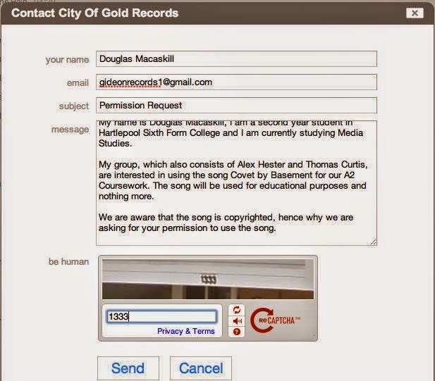
Permission Request
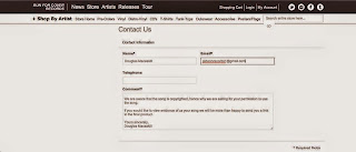
For permission of the use of the song Covet by Basement, we chose to contact the three people who will have permission to the song- the band and their two record companies. We used our record company email (gideonrecords1@gmail.com) to do this and contacted them via the band's email and on the contact section of the two record companies. This is so that we can avoid copyright issues as much as possible.


Friday 19 September 2014
Wednesday 17 September 2014
Digipak Analysis - Nirvana - Nevermind

The cover to the album Never Mind by Nirvana uses a photo of
a baby and money underwater that is took from the music video for Come as You
Are, which is featured in the album showing that there is a theme involved. The
reason behind this could be because of economic inequality, about how people are born rich or poor and affected by this
unfairly as a result; this is most likely targeting America shown by the money being a dollar.
The album’s name most likely relates to Kurt’s look on life or
the genre of Grunge and how everything around it is to do with being aggressive
or depressed. The text of this is written in a warped font which is linked to the water background photo. The artist name, however, is wrote in bold capitals; this is because it is the bands logo and is how fans will recognise it.
The blue colour of the imagery and the gender of the baby suggests the target audience might be male. On the other hand the image on the left is a complete contrast to the rest of the album in colour and in images (fire and water). This could be linked to the style of music because the music contrasts and changes from quiet to loud through the verses and choruses in a number of their songs.
The back of the album (seen in the middle of the image) shows the song names, the band name and the record company. This is essential information so people know what they are buying. In the background of this we can see that there is water which relates the front of the album- the font for the writing in this mixes well with these blue colours because of the font colour (black and white).
Tuesday 16 September 2014
Monday 15 September 2014
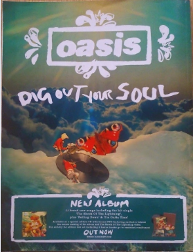
Advert Analysis - Oasis - Dig Out Your Soul
This advert contains images that follow the same art style found in the album; this is to follow the concept of the album name. The concept comes from the word soul, which is linked to the sky because that is what people may think of in a trail of thought from soul to heaven to clouds. The advert also has the same colours and imagery that the Digipak has.
The text of the advert has Oasis at the top to draw the
observer’s attention; next it has the album name so straight away people know
it’s about a new album. The font to this is the same to what is on the album cover
so that people will recognise it. Information is then given about the album
such as how many songs are on it, the hits and what versions there are of it. The
font/text works with the imagery of this advert because of the light colours it
all.
The colours to this advert are bright and vibrant in order to be eye catching, grabbing the target audience's attention in order to get more sales. The target
The colours to this advert are bright and vibrant in order to be eye catching, grabbing the target audience's attention in order to get more sales. The target
Saturday 13 September 2014
Digipak Analysis - Foo Fighters - Echoes, Silence, Patience and Grace
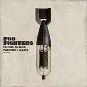
The album Echoes, Silence, Patients and Grace gets its name from the song Home. It is almost in complete contrast to the album's imagery of a bomb mixed with a valve audio amplifier and therefore is used to juxtapose because neither of these items and silent or graceful and in them selves aren't alike in many ways.
The colours to this album are plain and calm which fits the music and genre. This is because of some of the music on this album, unlike Foo Fighters normal songs, are slow tempo and relaxed.
This digipak definitely fits well with the target audience because of the use of imagery, colour and possibly the long name. The picture (a bomb) is right for the audience as it is a serious and controversial subject, in other words young children won't be talking about this type of thing.
The text is appropriate as it shows the artist name and album name in black to stand out from the grey background. The ampersand used in the album name is also note worthy because the colour of this is the same colour as the text on the back to try make the entire digipak work together in one colour scheme.
 On the back of this album there are the names of the songs and bonus track just like most albums; this is so people buying the album know where to look and what to expect. The back of the digipak also shows the production company and who helped in the making.
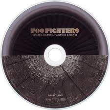 As for the CD artwork, the continuous theme of two things that don't fit together (and are almost opposite) has endured. This can also be seen in the album leaflet with pictures such as a babies head next to a heat monitor which is often associated with flat lining and therefore the opposite of birth- death. Another example is a stick of dynamite and an umbrella, these show no obvious opposites but again are not similar. This again could link to the music on the album because some of the tracks are slow and relaxing, some are fast and angry and some change.
The text is appropriate as it shows the artist name and album name in black to stand out from the grey background. The ampersand used in the album name is also note worthy because the colour of this is the same colour as the text on the back to try make the entire digipak work together in one colour scheme.
Friday 12 September 2014
Advert Analysis - Radiohead – Hail to the Thief

The imagery of this advert is directly related to the album
as it is almost the same, showing the main picture with a different background.
At the bottom right the album cover is shown so that people who might purchase
it know what it looks like. This key image contains multiple words such as
‘Block’, ‘TV’, ‘Drugs’ and ‘Trouble’, these are negative words located inside
of something which is growing; the connotation of this represents our community
and society and how it is possibly built up on corruption, commercialism and
undesirable ideology.
The text of this advert is used to advertise both the album
and their tour dates. Beneath the album name, information is shown such as the
release date and other available versions of the item for example vinyl. This
helps broaden the consumer’s availability to the music because they now know
they can play it on different media devices.
The colours of this advert are fairly dull/dark which fits
the bands image of commonly playing slow almost depressing, music. These
colours are also appropriate to the target audience of more mature young
adult/older males. This fits with the idea of having words with hidden meanings
because this audience may look for having lyrics and music that mean something
rather than simplistic and repetitive lines made just to be catchy.
MAP 1 - Feedback
This is the feedback I received from my media tutor showing me where I should improve and where I have succeeded. This will help me in my following work because I now know what things I should include.
The first sheet shows comments and areas of improvement for my detailed music video analysis and digipak analysis. The second shows the same for my advert analysis and shot count.
From this feedback I have learnt thatI should develop my work further by applying theory and by talking more about themes and concepts of products.
Wednesday 10 September 2014
Music Video Analysis - Kings of Leon - Use Somebody
Immediately this music video begins with a medium shot which is zooming out, next a mixture of clips of the band members, the band performing, high angle lips and sped up clips of traffic are shown. These are all short and fast clips with quick cuts to match the music. This then completely changes to long clips with slow transitions (starting with a fade transition to a clip of the singer) in order to match the new/slower tempo- showing that the first verse has began.
Throughout this verse multiple close ups are used on the lead sing along with shots of the other band members. This is used to show Kings of Leon's image- four American men all related to each other (with the lead singer, as in most rock bands, being in the main focus/icon).
Soon after this the song leads up to the chorus which is slightly faster and more upbeat, therefore to follow the rule so far of linking the speed of the music with the speed of the video, the shots length shortens and the cuts become faster. As well as this to match the slight happiness of the song, the clips become happier and more meaningful showing clips of the band playing in front of large crowds and talking to friends while playing pool.
When these clips are of the band members, they are usually medium or close up shots in order to strengthen the image of the band. Black and white effects are also used along with back stage footage to show how they are authentic. This can show how their music is talented and isn't fake like most pop music in modern day.
The theme of this music video is linked to night time, this can be seen through this video, the album its in and other music videos in the album its in. An example of this is Sex on Fire which links night time with sex. This can all link to modern day society and how sex is becoming an increasingly big feature in normal life.
Monday 8 September 2014
Shot Count Task - White Lies - There Goes Our Love Again
In this music video I counted approximately 108 shots, which
is about right for the musical genre (alternative rock/indie rock) and speed of
the song- unlike other genres such as dance which would have a lot more and
shorter shots. The majority of these are close-up and medium shots
concentrating on either the main character/dancer or the band. The video is
slightly narrative but mostly performance based- when the performer has the centre
of attention she is used to create entertainment while showing “a homage to 1960s Bollywood thriller Gumnaam”. This is a good example of intertextuality used to tribute a completely separate media text.
David Buckingham said, "Genre is not simply given by the culture,rather, it is in a constant process of negotiation and change." This music video is illustration of this because it uses a Bollywood film which is almost unheard of when looking at this type of genre. It is therefore trying to develop and be different to others and stand out amongst the rest.
David Buckingham said, "Genre is not simply given by the culture,rather, it is in a constant process of negotiation and change." This music video is illustration of this because it uses a Bollywood film which is almost unheard of when looking at this type of genre. It is therefore trying to develop and be different to others and stand out amongst the rest.
Wednesday 3 September 2014
The Brief
For this task as a group we have to create a music video
that relates to a song via the lyrics and music. We also have to create a
digipak for the album’s release and a magazine advertisement for the digipak.
Subscribe to:
Posts (Atom)