Christian Metz believed that genre alters over time through a process of development. He divided this process into 4 stages - 'Experimental', 'De-construction', 'Parody' and in the end 'Hyrid'.
Gunther Kress argues that genre evolves with our progression and changes in time and that text is written with the ideal audience.
In contrast to these theories, David Buckingham studied children's and young people's interactions with electronic media. Ever changing media means ever changing identities - development of the genre suggests that it is not simply culture but rather a constant process of change and negotiation.
Buckingham explores how the development of individuals understands the concept of identity, as a child identity is seen as a simple concept where by a child will simply differentiate between the male and female genders.
When we age, our identity becomes a lot more complex and it is no longer largely dependent on the sole idea of just establishing gender. Buckingham argues that genre is not simply given by the culture rather it is in a constant process of change.
Tuesday 30 December 2014
Friday 19 December 2014
Basement - Covet - Rough Cut 5
This is the 5th rough cut for our music video of the song "Covet" by Basement, we have improved the footage by including new improved shots and by fixing thought beats.
Monday 15 December 2014
Digipak Template

This is an example of a 6 panel digipak template in a PDF format- the type that we will use for our album. It contains six slots, one for the CD compartment on the inside, one for the front, one for the back and three inner panels.We will use this on Photoshop when creating the digipak on a separate layer to the actual picture in order to see how to layout our own design.
Saturday 13 December 2014
Basement - Covet - Rough Cut 4
This is our Fourth Video of our A2 Music video for the Covet by Basement.
This Cut has been improved because it has no gaps in the visual footage and has once again had new footage included in it. It also has more footage of the lead singer to fit Goodwins theory that will increase the chance of creating an image in our audience's mind. We also shortened some of the shots (in particularly the florist shots because they didn't link between cuts- the protagonist wasn't in the same position that he was in the last) so that they link to each other better, so more shots could be included and to link the pace of the edit to the song.
Friday 12 December 2014
Final Advert

This is the final idea of our media advert in its full completion with all the typical conventions used in the adverts for rock albums today such as the highest ratings from top magazines and a website link where you can learn more about the band.
Thursday 11 December 2014
Basement - Covet - Rough Cut 3
In this Rough cut I have made improvements in the use of practical effects, for example fades, stabilisation and different cuts have been used.
Monday 8 December 2014
Evidence of Star Image

The video starts and finishes throughout focusing primarily on our main character in the video who is both protagonist and lead performer in the idea that this will help the audience relate to this character and help establish that star image that we need to achieve.


Friday 5 December 2014
Thursday 4 December 2014
Audience Positioning - Stuart Hall
Stuart Hall is a cultural theorist which shows he should have some ideas on audiences when it comes to media and how texts are sent for the audience to perceive.
He looked at the role of audience positioning in the interpretation of mass media texts by different social groups. Hall built a model suggesting three ways in which the audience may perceive a media production:
Dominant Reading: The audience will read into the text or receive a message from a video exactly how the author or artist wanted them to, so the events seem natural and in order.
The Negotiated Reading: The reader believes the text or products conventions and message/narrative to some degree but sometimes modify certain aspects as to allow them to reflect and compare it to their own situation.
The Oppositional Reading: The position of the reader or audience places them perceiving the narrative in opposition to the dominant code and makes them reject the reading or narrative.
Hall was concerned with the power of media, with aspects of how it propagates particular social values, to create dominant ideologies (how it represents certain things and makes the audience think of them in that certain way).
He believes that the media masses create and define certain issues of public concern and interest with the theory of audience positioning and how they portray their message and what target audience they send it out to.
Polysemy - is the capacity for a text or narrative to have multiple meanings, it is to do with how individuals interpret and decode the messages in different contexts for reasons such as culture, age, upbringing and so forth.
Feedback from Ben Young Teeside University
Ben Young, from Teeside University came into our college and listened to the ideas of our class focusing mainly on narrative. He believed that setting your audience up and then deceiving them at the climax of the video as " the audience likes to be surprised" and therefore straying away from the norm in our genre is a must to keep the audience interested past the 20 second mark. He believes we can not achieve the audience's full interest throughout the video if we only have the protagonist waking up and walking to see whoever the song is about throughout the video with sections of live performance, He believes there needs to be more happening with the the character of the boy throughout the narrative to make it interesting and to hint towards a different cause than to her grandma. We are taking this on board and plan to add extra occurrences during the walk to the home as to possibly develop the character more and to give the audience more to relate to in terms of Andrew Goodwin's theory of star image and the main character of the narrative being easy to relate to in terms.
Wednesday 3 December 2014
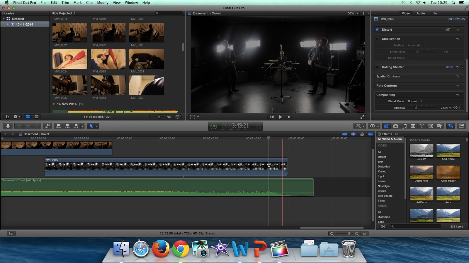
Editing- Tuesday, 2nd of December
During this lesson we made more progress on the video by adding extra footage, changing the narrative (towards the end the grandmother isn't going to be awake so the shots have more impact), arranging extra shooting and by adding a fade out at the end of the video so that video ends smoothly. We added the fade out effect by altering compositing so that the opacity reduces as it reaches the end of the clip.
Tuesday 2 December 2014
Andrew Goodwin
Goodwin is a theorist who specialised in media and came up with many different ideas about music videos and how they are successful.
In his book (Dancing in the Distraction Factory) Andrew Goodwin writes about six characteristics and features seen in music video.
These are:
Our video will support Andrew Goodwin’s theory because it will use a large amount of shots that concentrate on the bands image; this will help to create a brand identity insisted by the record label. Another way our video will demonstrate Andrew Goodwin’s theory of six characteristics is by using performance shots of the band which will demonstrate the genre of rock using real instruments.
These are:
- Genre representation such as linking pop with dancing or rock with band performance.
- Lyrics/visuals link- words represented by imagery.
- Music/visuals link- the atmosphere of the video matches the music in ways such as through illustration, amplification or disjuncture and through things like thought beats.
- The need of specific shots such as close-ups requested usually by the record company in order to create a mental image of the artist or a label.
- Reference to notion of looking and voyeuristic treatment towards the female body which links towards Laura Mulvey’s Male Gaze Theory.
- Intertextual links to other media products such as TV shows and films.
Our video will support Andrew Goodwin’s theory because it will use a large amount of shots that concentrate on the bands image; this will help to create a brand identity insisted by the record label. Another way our video will demonstrate Andrew Goodwin’s theory of six characteristics is by using performance shots of the band which will demonstrate the genre of rock using real instruments.
Audience Theory - Julian McDougall (2009)
Julian McDougall suggests that in the online age it is getting harder to conceive a media audience as a stable, identifiable group.
However- audiences still clearly make sense and give meaning to cultural products.
An audience can be described as a "temporary collective" (McQuail, 1972).
Key terms:
Mass/Niche & Mainstream/Alternative
This theory can be applied to my products when identifying our audience as alternative rather than mainstream, mass or niche because it isn't found within the most popular of genres although it has still got a large audience size.
Monday 1 December 2014

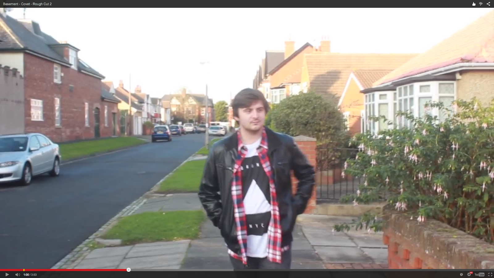
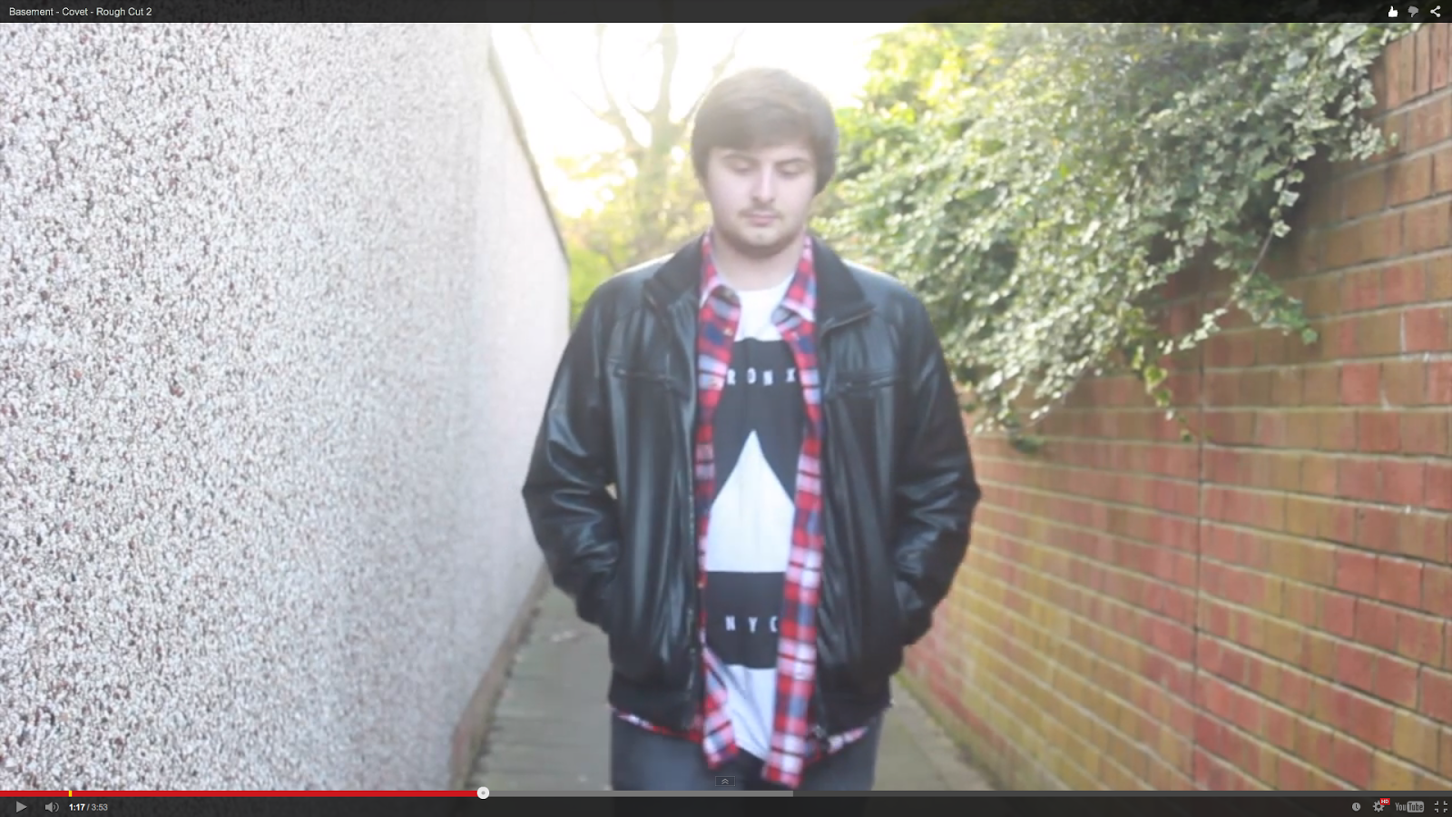
Basement - Covet - Rough Cut 2
This is our second rough cut which has been improved because it has more footage for both narrative and performance, better thought beats and has footage from another setting (the care home).
We plan on improving this more by gathering more footage in order to get rid of blank spots (particularly the shot of him and his girlfriend) and reshoot individual shots that look fuzzy or shaky.
Wednesday 26 November 2014
Peer Feedback 1
Our first rough cut was shown to a class of 17 pupils so that we could obtain feedback. This photo shows an overview of the feedback received, including the the most mentioned improvements suggested and strengths given.

Strengths:
- Good lip sync
- Good thought beats
- Range of shots used
Improvements:
- Improve pace of edit (make the pace link to the edit)
- Stabilise the shots
Monday 24 November 2014
Basement - Covet - Rough Cut 1
This is the first rough cut for our A2 Media Project. For this module we have to create a music video that includes genre representation, lip sync and narrative.
The video begins with a shallow focus extreme close up of the vocalist/microphone in order to begin with lip sync. We chose to do this because this is how the song begins therefore linking the music to the visuals. The video then continues by cutting to the music (thought beats). The moment when an actual picture comes up is only to fill where we want to include particular footage.
So far the footage reaches the end of the video although the there are lots of blank spots because we need to reshoot or find a way to fit things in the right sections.
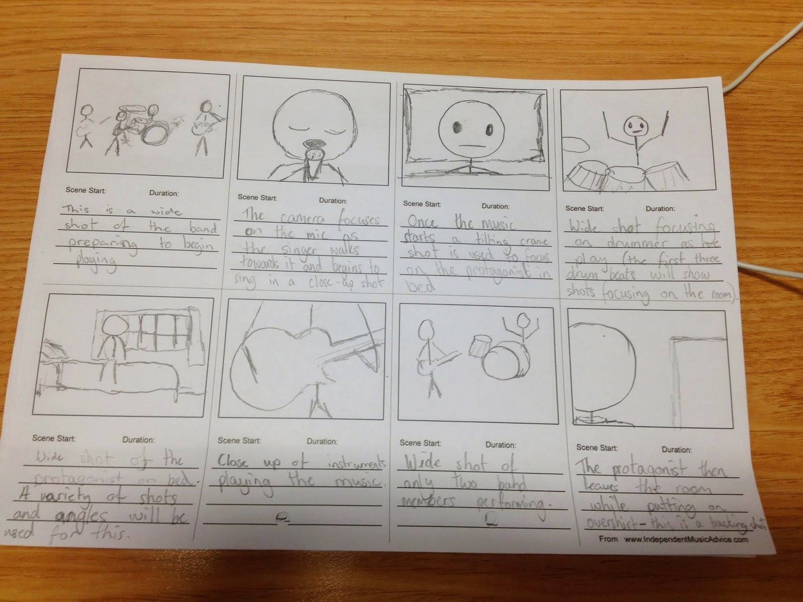
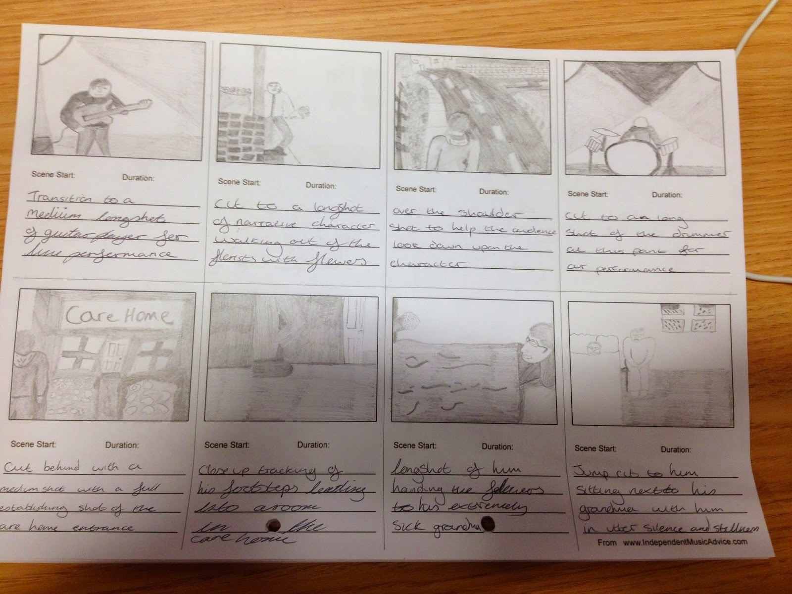
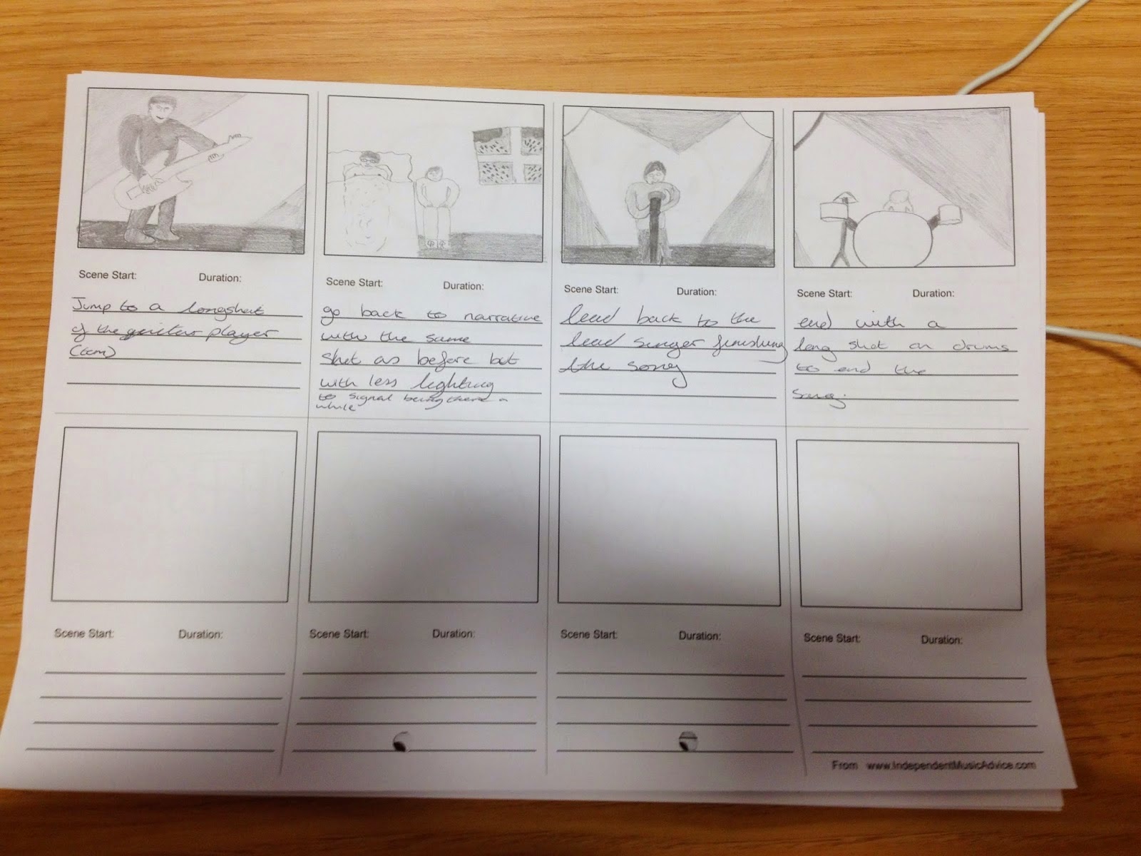
Animatic
This is the Animatic from our storyboards which gives a brief overview of how we initially pictured our final idea for this product. there are a few differences however you get a lot of similar shots and the same narrative from this so it does not lead you away from what you see in the video.
Friday 21 November 2014
Tuesday 18 November 2014
budget Sheet
When planning out our music video project, we have come to the realisation that some of our ideas and plans for the video include a lot of travelling, as well use of props. Because of this, we have decided to budget our video and therefore estimate the outgoing costs that we need to think about before filming.
Narrative
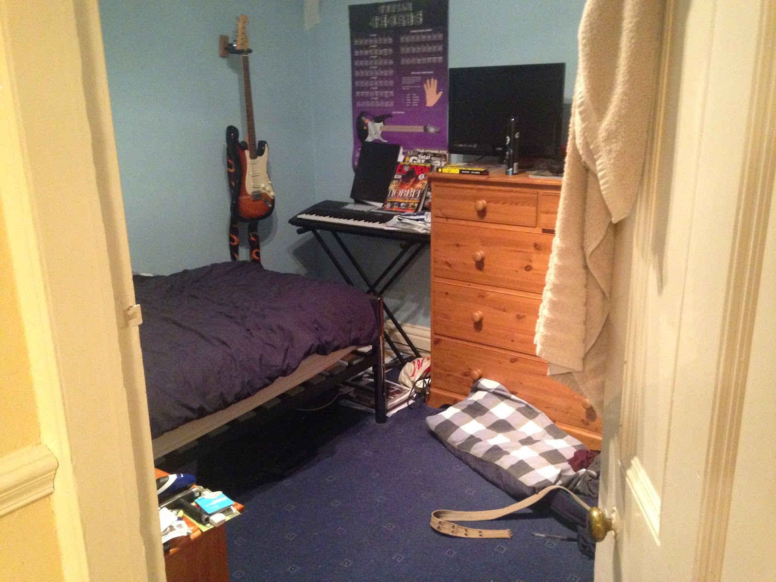
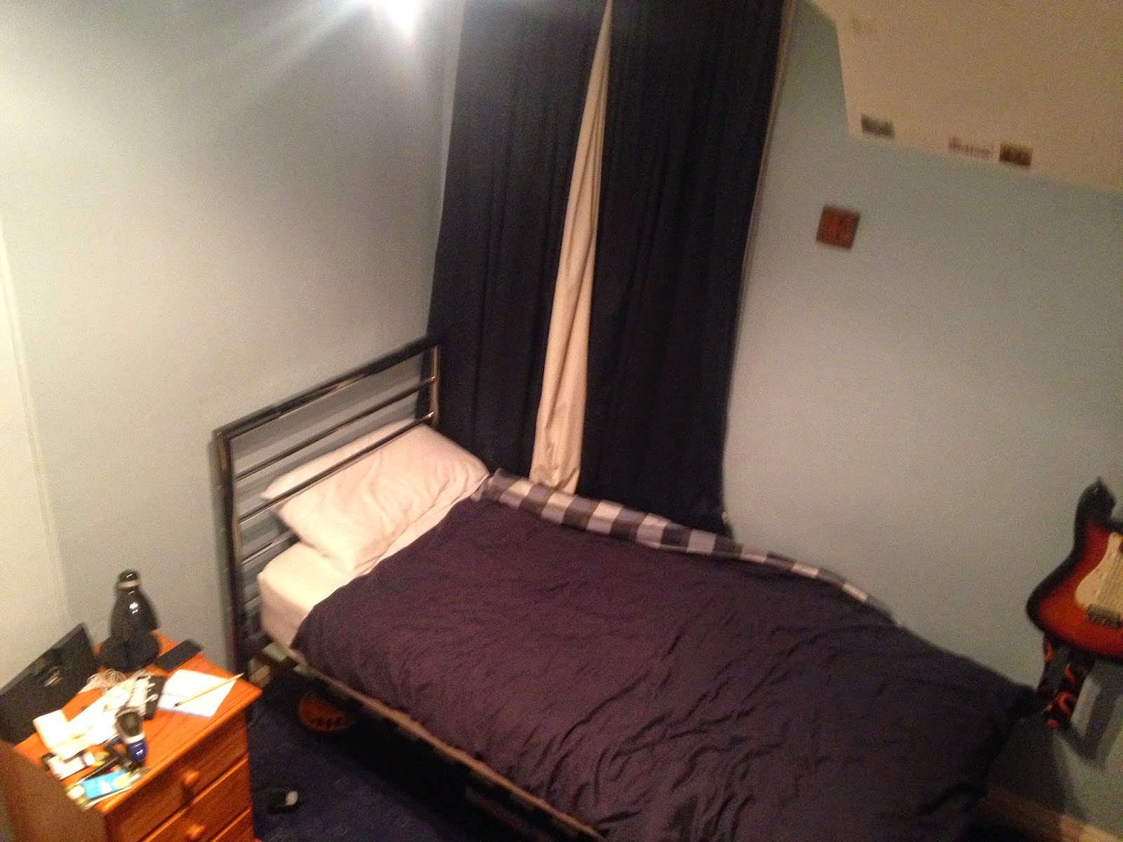
Bedroom
No budget is needed for these shots as all props provided are already owned and is within walking distance of the college.
Flower Shop
£5-£10 is needed for the flowers, which will also be used in the Care Home scenes.
No budget will be needed for travel as it is within walking distance of the bedroom scene and college.
Care Home
£10 is needed for the Grandma's costume which we will purchase the week before filming.
£15 is needed for travel, most likely, for both cast and crew.
Performance
Studio
No budget is needed for the performance as the setting is within walking distance of the college.
No budget is needed for props as the cast and crew are using their own instruments.
Narrative
Bedroom
No budget is needed for these shots as all props provided are already owned and is within walking distance of the college.
Flower Shop
£5-£10 is needed for the flowers, which will also be used in the Care Home scenes.
No budget will be needed for travel as it is within walking distance of the bedroom scene and college.
Care Home
£10 is needed for the Grandma's costume which we will purchase the week before filming.
£15 is needed for travel, most likely, for both cast and crew.
Performance
Studio
No budget is needed for the performance as the setting is within walking distance of the college.
No budget is needed for props as the cast and crew are using their own instruments.
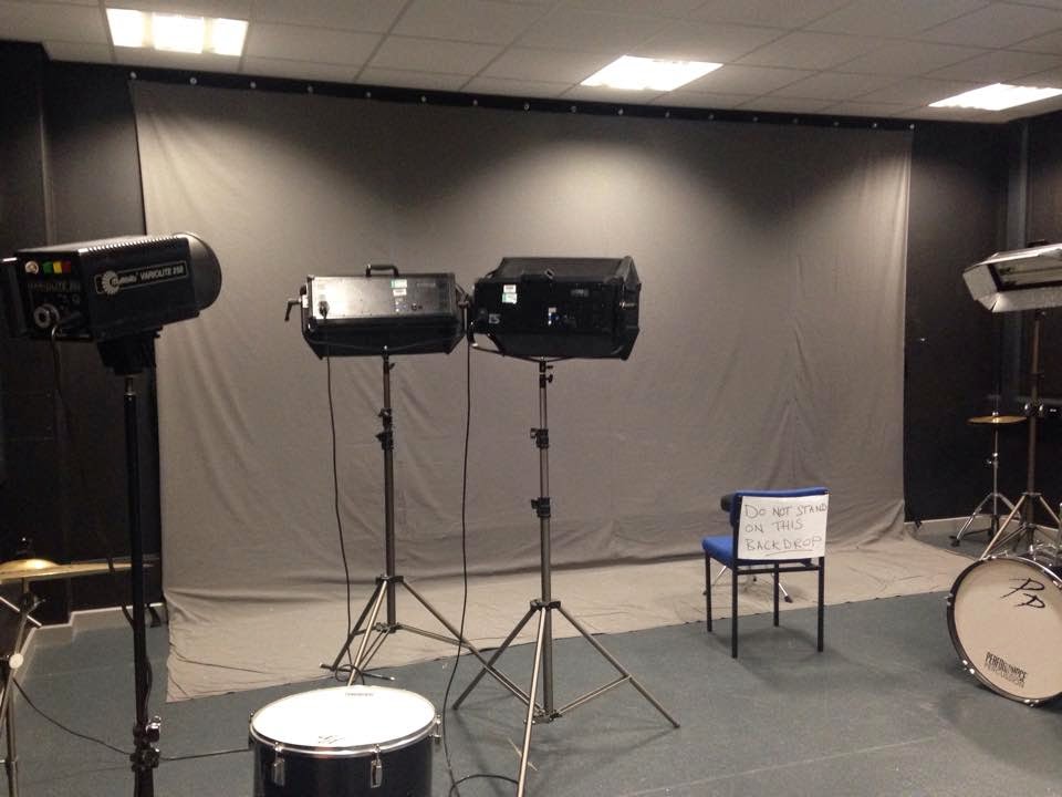
Equipment Analysis
The equipment we are planning to use is:
·
A Canon EOS 1100D DSLR Camera
· A Tripod
· A Tripod
·
Track and Dolly
·
X4 Lights.
The first three pieces of equipment are going to be used for
the entire video while the lights will only be used for the TV Studio for
performance because of compatibility issues.
The Canon we will use in our video has HD video capture with
12-megapixel image quality. This will increase the footage quality in our video
and make it look more professional. This camera also allows us to use zoom and
allows us to get deep or shallow focus shots because of its automatic and
manual focus settings.
The tripod will allow us to achieve steadier shots, especially ones that require us to capture a certain shot for a long period of time. This is important as we need our footage to look as clear and sturdy as possible.
By using the Track and Dolly we will be able to obtain a
wider range of shots including crane or tracking shots and shot angles such as
higher high angles. The track will also allow us to get steadier/more stable footage.
The four lights will be used during our recording sessions
inside of the TV studio to improve our lighting and the visibility of the
performers.
Choosing The Song
We originally had many ideas and drafts for the song choice of our media product. At first we went through different artists in our genre area and came to decision that we would use 'Emily' by Lower Than Atlantis.
However after planning the video we realised how common it was for an A2 media group to want to use a song such as this and use the extremely plain and simple idea of a boy loving a girl and them falling in love during the song, we decided to change our idea and go for a darker, less joyful song which we could use to perhaps alter the narrative into something that no one was expecting and not follow the trend that has been set by so many videos throughout the course.
When thinking of a song we came up with 'Covet' by Basement which had slower lyrics and a darker tone which helped us achieve what we wanted to do in terms of mixing up what is usually seen in previous years.
The song is relatively short but there is enough time for us to get lip sync in the performance sequences and camera and editing in the narrative to get a good grade at the end of the course.
Editing- Tuesday, 18th of November
This lesson we made progress on the first rough cut. The narrative shots captured so far have been added to final cut timeline. So far we have reached 1:06 and have edited individual shots by using stabilisation to stop them from shaking as much.

In the image above you can see gaps between shots; this is because we have captured shots that we know we want for specific moments (so that it links to the music through thought beats). This has left us with gaps that we now have a better idea of what to fill it with because we have progressively edited the video rather than getting all of the footage then editing.

Monday 17 November 2014
MAP 2 Review
This review gives feedback on how I have developed following my MAP 2 Feedback, it gives me extra points of improvement to the initial feedback and tells me how I have improved so that I know whether I am doing my work correctly.
Wednesday 12 November 2014
Monday 10 November 2014
Friday 7 November 2014
Tuesday 4 November 2014
Evidence of Group Discussion
To be able to contact each other though out the week, our group has created a chat inbox on Facebook. We chose this site because each member of the group has an account on it and uses it quite often.
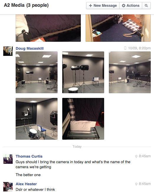
We also used this site to contact the cast as each member has an account as well.
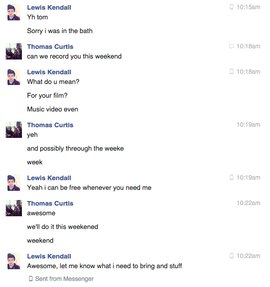
We also used this site to contact the cast as each member has an account as well.
To plan times for meeting up with the group outside of college, we have got a Timetoast timeline which shows all the times we have done work together and what we did.
Friday 31 October 2014


Wednesday 29 October 2014
Monday 27 October 2014
Call Sheets
Now that we have chosen our video concept and locations, we need to organise times for when we can record. This is when all of the crew and cast (needed for the shots) will be available. To make this an easier task we have created call sheets that provide all members of the video with the location, details and what they need for the shots, as well as this it shows the time and date that we will be shooting.
We have presented all of the information in tables so that information is easy to find and understand. To show where the locations are, we have used google maps for images to give everyone an idea of where each place is.
We have presented all of the information in tables so that information is easy to find and understand. To show where the locations are, we have used google maps for images to give everyone an idea of where each place is.
Sunday 26 October 2014
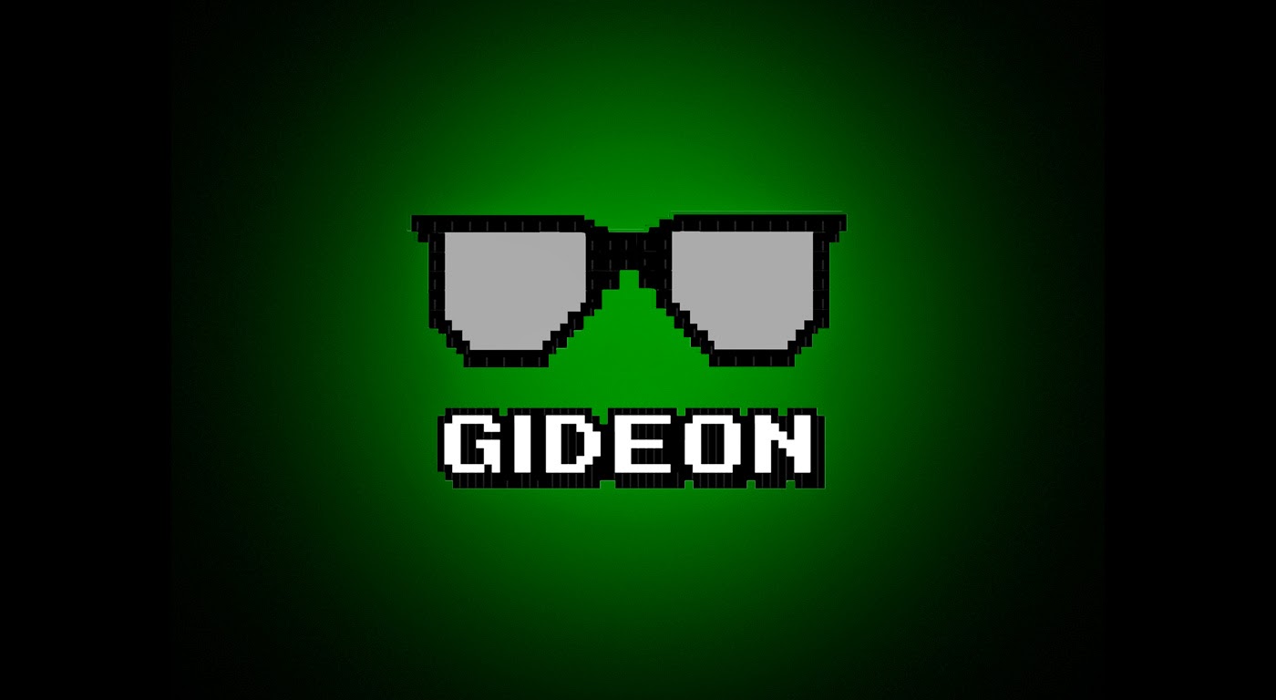
Gideon Records Final Logo
Below are the three versions of our final logo design used for our record company, Gideon Records, each used for individual things in our coursework.
The first one shown is the smaller of the three, as its primary use is as a watermark, this makes it easier to be placed things such as photos of the band and important documents (such as call sheets and the treatment).
The second one shown is the larger version of the logo. This version will most likely be the one used in our music video and will feature special effects to make the writing appear on screen at a different time to the glasses.
The final version features the original logo but with a black background. The green rectangle is replaced with a faded green circle. This highlights the the main logo and gives the white writing more character.

Friday 24 October 2014
Tuesday 21 October 2014
Monday 20 October 2014
Friday 17 October 2014
MAP 2 - Feedback
 |
| MAP 2 Page 1 |
 |
| MAP 2 Page 2 |
This feedback (on page 2 of MAP 2) given by my tutor shows an overview of how well done my currently assigned work is. The first table shows which tasks are better and which need improvements. Next is a comments section that shows strengths and suggested improvements followed by three suggested targets.
From this I have decided to attend AST sessions and have learnt that my assessments are what need to be improved the most.
Wednesday 15 October 2014
Tuesday 14 October 2014
Friday 10 October 2014
Tuesday 7 October 2014
Audience Profile
From our audience profile questionnaire we have found a
basic idea of our target audience. We did not have many answers but the answers
that we did get showed clearly the usual interests of this age and type of
person. Our researched showed:
·
Our audience is between the ages 17 to 21,
·
Are mainly male,
·
Often listen to a good amount of music every
day,
·
Like a range of genres which usually fit into
the same category including rock, pop, punk, Alternative etc.
From this information I have created an average person for this target audience and how I imagine they are.
 This is Adam; he is 17 years old and studies at a Sixth Form College doing music, music technology and maths. He is fairly intelligent and has a good amount of friends from college and school. He spends a lot of his time socialising, playing games and listening to music. In his own time he uses social media sites like Facebook and Twitter to talk and find about the things that interest him like different artists. Josh enjoys quite a large range of music including Pop, Rock, Alternative and Punk as well as other genres. Usually he listens to artists/bands such as Basement, Biffy Clyro and Nirvana. Here is Josh’s playlist of some songs he likes:
From this information I have created an average person for this target audience and how I imagine they are.
This is Adam; he is 17 years old and studies at a Sixth Form College doing music, music technology and maths. He is fairly intelligent and has a good amount of friends from college and school. He spends a lot of his time socialising, playing games and listening to music. In his own time he uses social media sites like Facebook and Twitter to talk and find about the things that interest him like different artists. Josh enjoys quite a large range of music including Pop, Rock, Alternative and Punk as well as other genres. Usually he listens to artists/bands such as Basement, Biffy Clyro and Nirvana. Here is Josh’s playlist of some songs he likes:Thursday 2 October 2014
Application of Theory
Friday 26 September 2014
Audience Research Survey
https://www.surveymonkey.com/s/D75CCTJ
We made this questionnaire to gather information about our audience and what they think should be included in our music video. This will enable us to link our music video to the appropriate target audience for our genre (rock) and make sure we get a good opinion and review from them.
The questions begin with 'How old are you?' and 'What is your gender?' in order to gather information about who is answering our question. Therefore if we find that they are a fan of the genre of our music video (our target audience), we will know that their opinion/answers are what we should be considering more. The questions after this then give us information that we should use to help with our music video- including what our target audience would like to see in music videos such as whether they want more narrative (story) or performance.
From these result we have put together an evaluation of the results and constructed an audience profile which represents an average person within our target audience:
http://tomcurtisg324.blogspot.co.uk/2014/10/audience-profile.html
Wednesday 24 September 2014
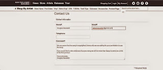
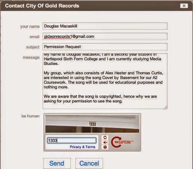
Permission Request
For permission of the use of the song Covet by Basement, we chose to contact the three people who will have permission to the song- the band and their two record companies. We used our record company email (gideonrecords1@gmail.com) to do this and contacted them via the band's email and on the contact section of the two record companies. This is so that we can avoid copyright issues as much as possible.


Friday 19 September 2014
Wednesday 17 September 2014
Digipak Analysis - Nirvana - Nevermind

The cover to the album Never Mind by Nirvana uses a photo of
a baby and money underwater that is took from the music video for Come as You
Are, which is featured in the album showing that there is a theme involved. The
reason behind this could be because of economic inequality, about how people are born rich or poor and affected by this
unfairly as a result; this is most likely targeting America shown by the money being a dollar.
The album’s name most likely relates to Kurt’s look on life or
the genre of Grunge and how everything around it is to do with being aggressive
or depressed. The text of this is written in a warped font which is linked to the water background photo. The artist name, however, is wrote in bold capitals; this is because it is the bands logo and is how fans will recognise it.
The blue colour of the imagery and the gender of the baby suggests the target audience might be male. On the other hand the image on the left is a complete contrast to the rest of the album in colour and in images (fire and water). This could be linked to the style of music because the music contrasts and changes from quiet to loud through the verses and choruses in a number of their songs.
The back of the album (seen in the middle of the image) shows the song names, the band name and the record company. This is essential information so people know what they are buying. In the background of this we can see that there is water which relates the front of the album- the font for the writing in this mixes well with these blue colours because of the font colour (black and white).
Tuesday 16 September 2014
Monday 15 September 2014
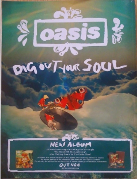
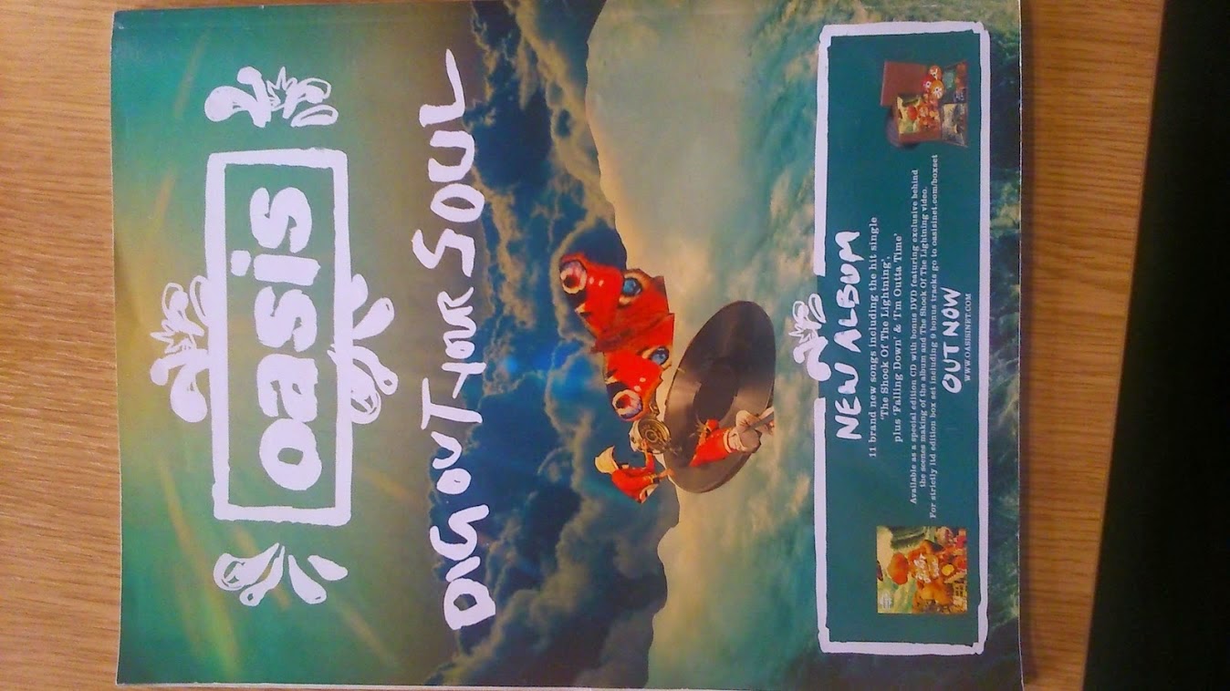
Advert Analysis - Oasis - Dig Out Your Soul
This advert contains images that follow the same art style found in the album; this is to follow the concept of the album name. The concept comes from the word soul, which is linked to the sky because that is what people may think of in a trail of thought from soul to heaven to clouds. The advert also has the same colours and imagery that the Digipak has.
The text of the advert has Oasis at the top to draw the
observer’s attention; next it has the album name so straight away people know
it’s about a new album. The font to this is the same to what is on the album cover
so that people will recognise it. Information is then given about the album
such as how many songs are on it, the hits and what versions there are of it. The
font/text works with the imagery of this advert because of the light colours it
all.
The colours to this advert are bright and vibrant in order to be eye catching, grabbing the target audience's attention in order to get more sales. The target
The colours to this advert are bright and vibrant in order to be eye catching, grabbing the target audience's attention in order to get more sales. The target
Saturday 13 September 2014
Digipak Analysis - Foo Fighters - Echoes, Silence, Patience and Grace
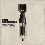
The album Echoes, Silence, Patients and Grace gets its name from the song Home. It is almost in complete contrast to the album's imagery of a bomb mixed with a valve audio amplifier and therefore is used to juxtapose because neither of these items and silent or graceful and in them selves aren't alike in many ways.
The colours to this album are plain and calm which fits the music and genre. This is because of some of the music on this album, unlike Foo Fighters normal songs, are slow tempo and relaxed.
This digipak definitely fits well with the target audience because of the use of imagery, colour and possibly the long name. The picture (a bomb) is right for the audience as it is a serious and controversial subject, in other words young children won't be talking about this type of thing.
The text is appropriate as it shows the artist name and album name in black to stand out from the grey background. The ampersand used in the album name is also note worthy because the colour of this is the same colour as the text on the back to try make the entire digipak work together in one colour scheme.
 On the back of this album there are the names of the songs and bonus track just like most albums; this is so people buying the album know where to look and what to expect. The back of the digipak also shows the production company and who helped in the making.
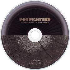 As for the CD artwork, the continuous theme of two things that don't fit together (and are almost opposite) has endured. This can also be seen in the album leaflet with pictures such as a babies head next to a heat monitor which is often associated with flat lining and therefore the opposite of birth- death. Another example is a stick of dynamite and an umbrella, these show no obvious opposites but again are not similar. This again could link to the music on the album because some of the tracks are slow and relaxing, some are fast and angry and some change.
The text is appropriate as it shows the artist name and album name in black to stand out from the grey background. The ampersand used in the album name is also note worthy because the colour of this is the same colour as the text on the back to try make the entire digipak work together in one colour scheme.
Friday 12 September 2014
Advert Analysis - Radiohead – Hail to the Thief

The imagery of this advert is directly related to the album
as it is almost the same, showing the main picture with a different background.
At the bottom right the album cover is shown so that people who might purchase
it know what it looks like. This key image contains multiple words such as
‘Block’, ‘TV’, ‘Drugs’ and ‘Trouble’, these are negative words located inside
of something which is growing; the connotation of this represents our community
and society and how it is possibly built up on corruption, commercialism and
undesirable ideology.
The text of this advert is used to advertise both the album
and their tour dates. Beneath the album name, information is shown such as the
release date and other available versions of the item for example vinyl. This
helps broaden the consumer’s availability to the music because they now know
they can play it on different media devices.
The colours of this advert are fairly dull/dark which fits
the bands image of commonly playing slow almost depressing, music. These
colours are also appropriate to the target audience of more mature young
adult/older males. This fits with the idea of having words with hidden meanings
because this audience may look for having lyrics and music that mean something
rather than simplistic and repetitive lines made just to be catchy.
MAP 1 - Feedback
This is the feedback I received from my media tutor showing me where I should improve and where I have succeeded. This will help me in my following work because I now know what things I should include.
The first sheet shows comments and areas of improvement for my detailed music video analysis and digipak analysis. The second shows the same for my advert analysis and shot count.
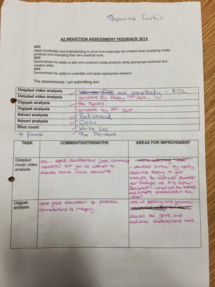
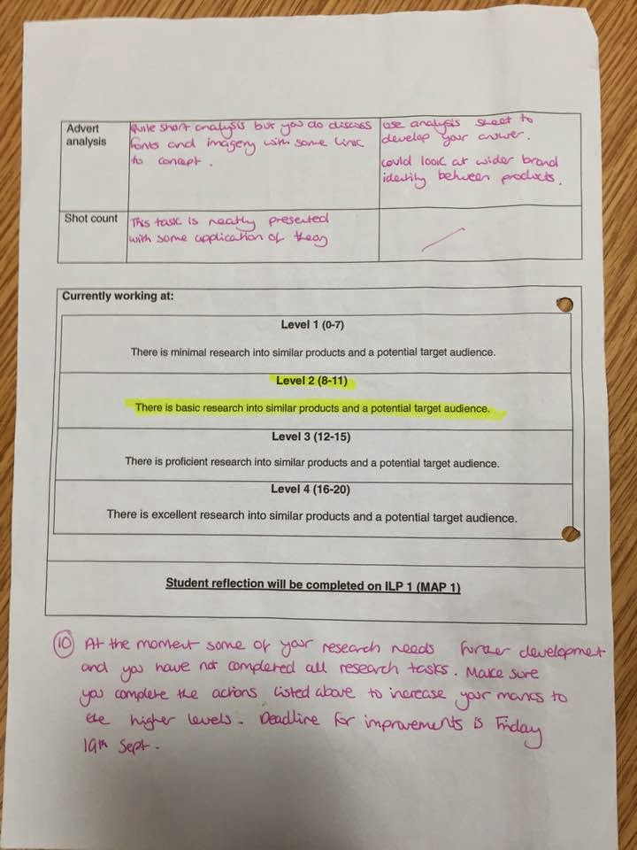
From this feedback I have learnt thatI should develop my work further by applying theory and by talking more about themes and concepts of products.
Subscribe to:
Posts (Atom)